
Dan LeBlanc Design
Designer with 20+ years of experience in web, marketing, content creation, user experience, and print. I've created everything from websites and user interfaces to marketing campaigns, newsletters, motion graphics, video content, and print materials including labels, brochures, and billboards.Microsoft UX Design Certified, I bring both creative skills and strategic thinking to projects that deliver measurable results.
Cashadvisor.ai
Project Overview
Cashadvisor is an affiliate marketing platform designed to deliver targeted banner advertisements. Its goal is to eliminate text-heavy interfaces and increase user engagement. For this project, I pioneered an innovative approach using AI avatars and video banners, a novel combination for the affiliate marketing industry.
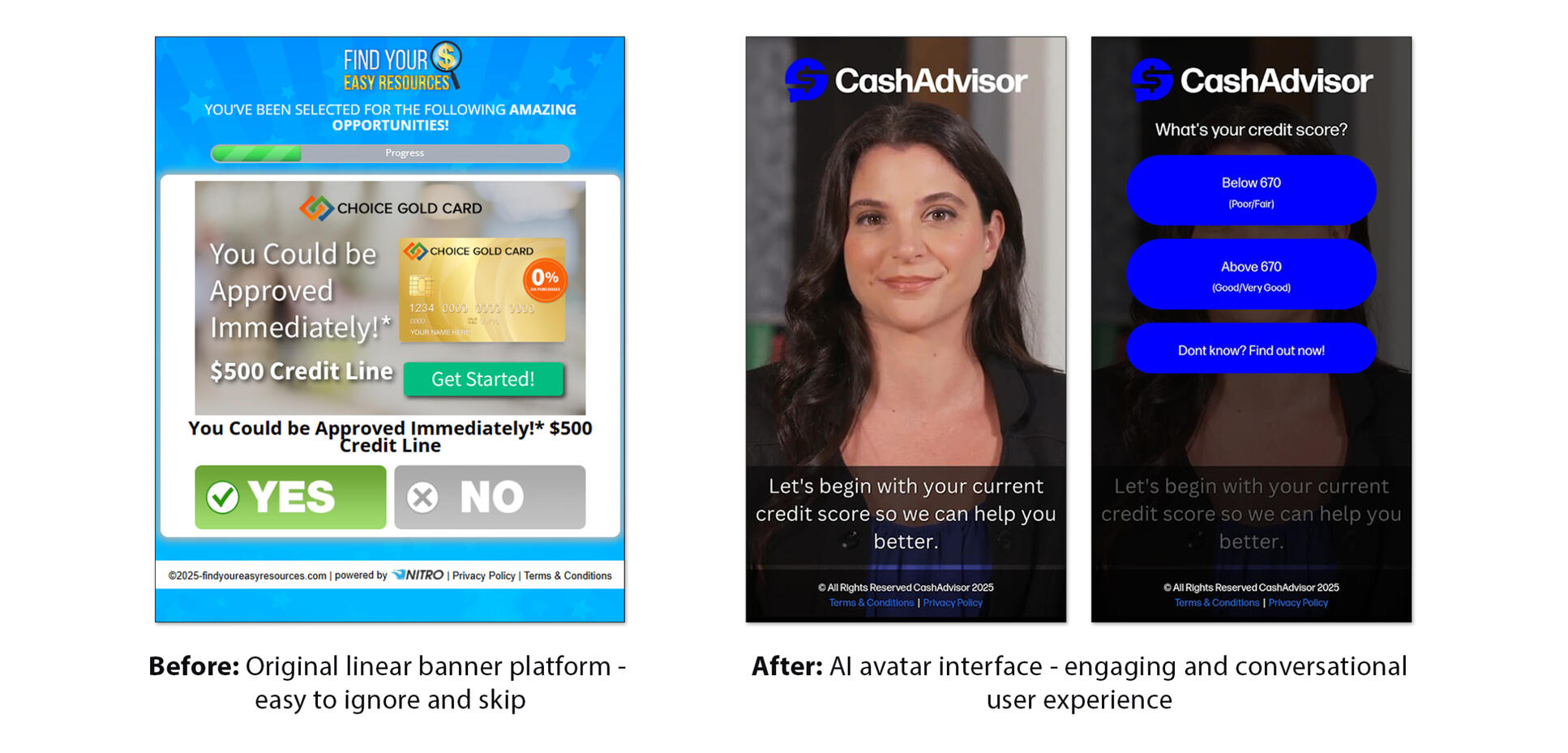
the problem
Affiliate banner click-through rates suffered a decline to only 5-10%, well below previous performance and impacting business results.Our existing platform's linear flow, which had produced great results for years, was beginning to show its age as users became accustomed to simply hitting next repeatedly or closing the platform altogether.
the process
After conducting user interviews, we discovered that users had increasingly shorter attention spans and were not as engaged by the linear presentation as they were in the past.In particular, they found the messaging easy to ignore or too bothersome to read, and considered the platform cumbersome.With these pain points in mind, we conducted brainstorming sessions to define the core challenge: how to make affiliate content engaging rather than ignorable.
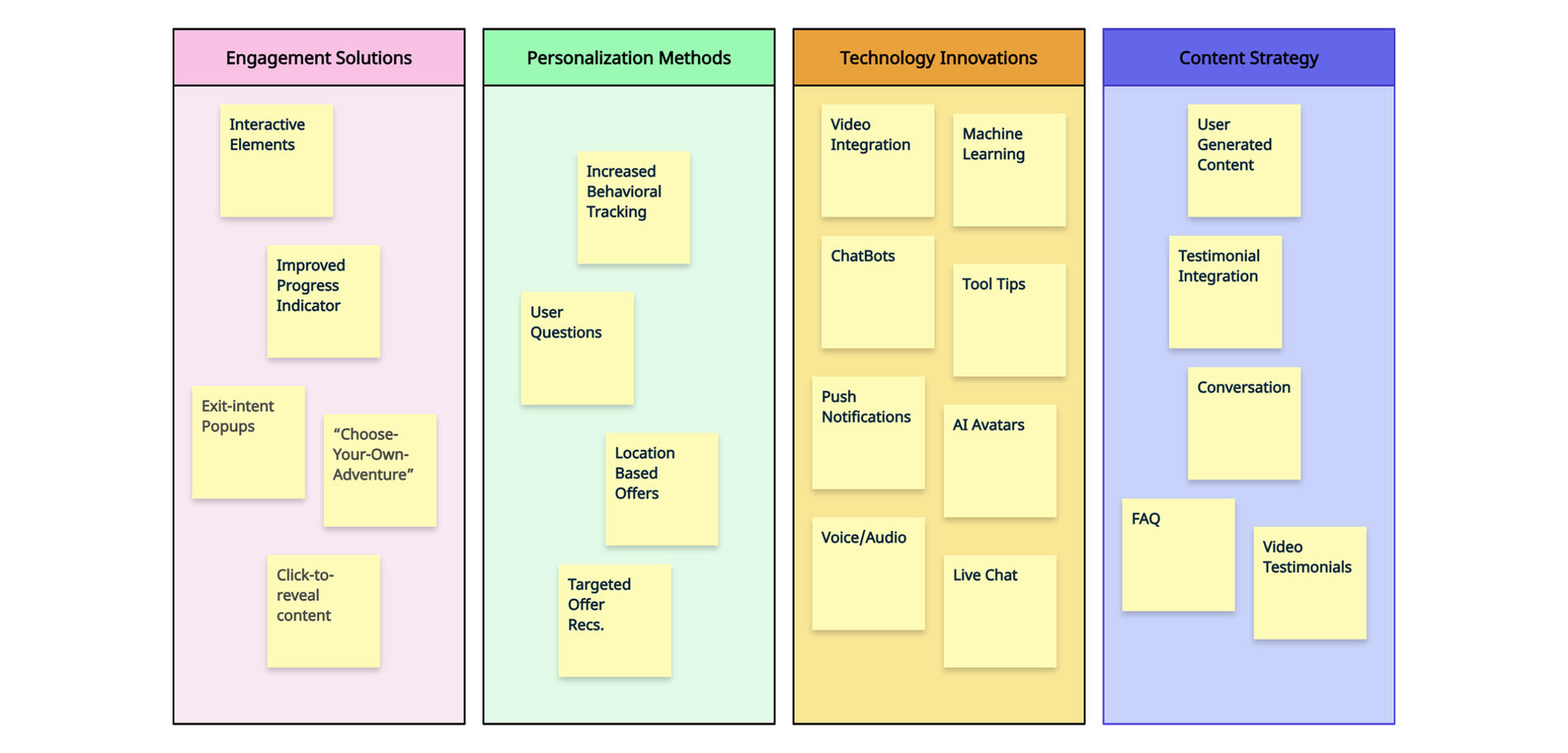
All our brainstorming ideas were grouped into an affinity map, which provided us with a clearer picture of potential solutions
solution
Given our recent experience with AI voiceovers in video banners, I proposed taking this further with a fully animated AI 'Cash Advisor' avatar. This avatar would ask concise, targeted questions in a choose-your-own-adventure format, engaging the user while also directing them to the most relevant offers for their needs.
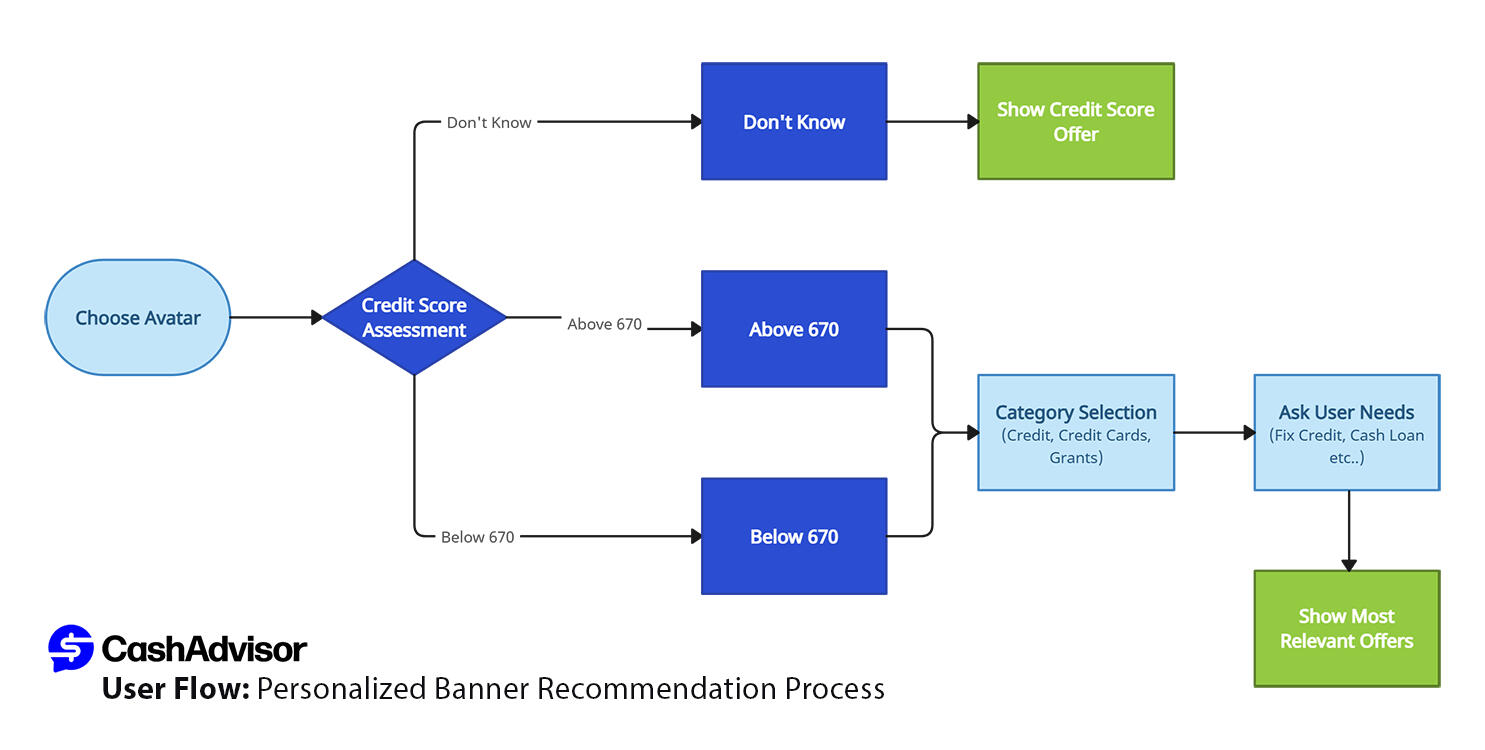
We created a prototype to test the avatar concept and user flow. With AI avatars being a new concept that was unfamiliar to most users, including my colleagues on the project, at the time, I developed two fully animated character videos as proof of concept to demonstrate the experience beyond just descriptions. Both stakeholders and test users responded positively, and we moved forward with development.
iteration
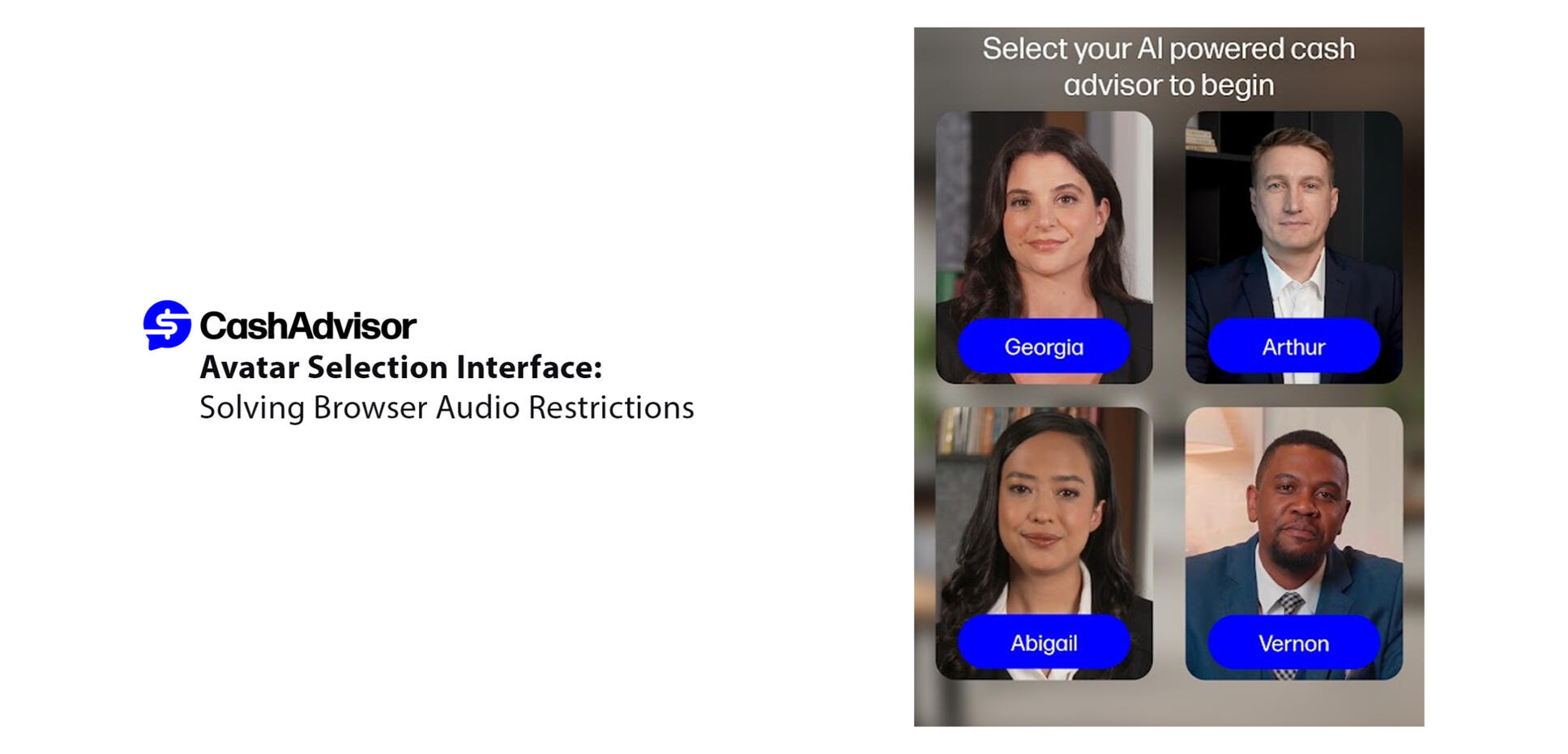
Upon user testing, we discovered that browser restrictions prevented the avatar's audio from starting automatically without a user click. Initial solutions like 'click for audio' buttons tested negatively with users.After another brainstorming session, we developed a solution: presenting users with four diverse avatar options immediately on the homepage. This approach allowed users to choose their preferred advisor while providing the critical click needed to enable audio.
Continuing to iterate based on user feedback, we added captions to the avatar dialogue to increase accessibility. Users responded positively to this 'subtitle' format, which challenged our initial assumptions about text-heavy interfaces—the key was pairing text with engaging audio spoken to them by a lifelike character.
results
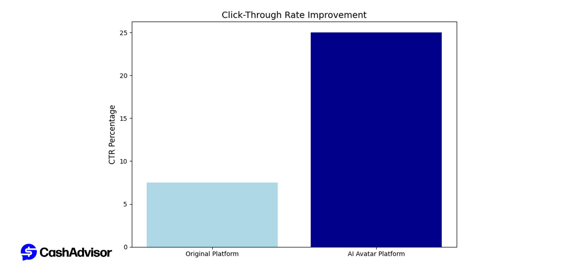
The new AI avatar interface significantly improved user engagement. Click-through rates increased from 5-10% to an average of 25%, while completion rates also improved due to users receiving more targeted offers based on their question responses.Users found the avatar experience more engaging and intuitive compared to our traditional banner platform.
what we learned
This project reinforced the value of iterative design and staying open to user feedback. Technical challenges like browser audio restrictions became opportunities—leading us to create diverse avatar options that enhanced not only user choice but also inclusivity.Additionally, user testing challenged our assumptions about text-heavy interfaces. We also learned that text, when paired with personalized, spoken dialogue, actually improved engagement rather than creating the burden we initially expected.
Click the video above to watch the finalized project in action.
Video Banners
In 2025, we experimented with replacing traditional banner ads with narrated video ads. Using the same principles as our static banners, the focus remained on quick turnaround and utilizing available assets from the offer website, while adding dynamic animation and professional narration to capture attention in an increasingly crowded digital space.The following is a sample of the over 100 video banners I've recently created.
Viva Fresh Food
Project Overview
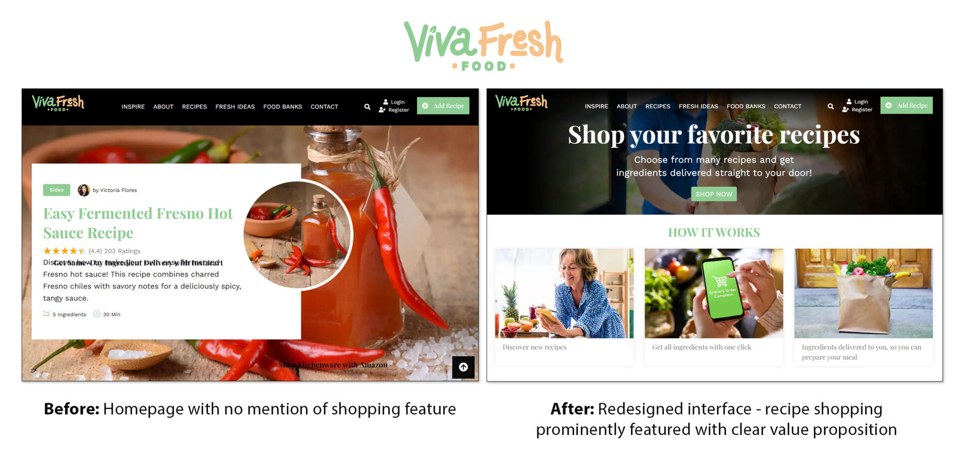
VivaFreshFood was initially a recipe website focused on kitchen equipment affiliate marketing. I led an information architecture redesign to emphasize our key innovation: one-click ingredient delivery through the integration of Instacart.
THE PROBLEM
After launching our one-click ingredient delivery feature, we quickly discovered through heatmap analysis and key performance indicators that users were not engaging with it. We needed to understand why users weren't interacting with this feature which we believed would be most valuable to them.
THE PROCESS
User testing revealed that users weren't noticing the "Get ingredients from Instacart" button below recipes as the button alone was too inconspicuous.
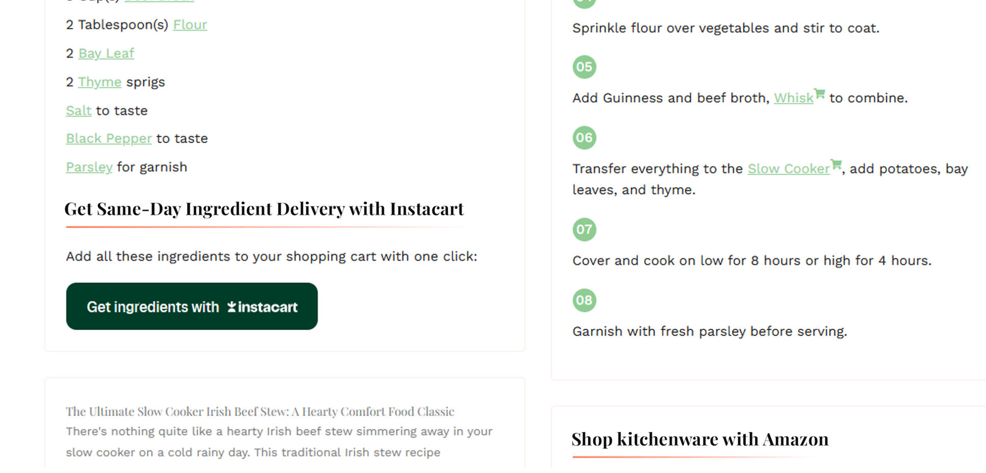
The Original Shoppable Recipe Feature Placement: Buried and Overlooked by Users
During our brainstorming sessions, we explored multiple approaches to bring attention to this feature. This included banner placement options, messaging variations, button labelling and alternative solutions such as popups or tooltips.
SOLUTION
Based on our user testing insights and ideation sessions, we determined that this feature deserved the most prominent real estate on the site. We implemented a hero banner as the first element users encountered upon arrival to the site, introducing the concept of shopping recipes with one-click ingredient delivery.
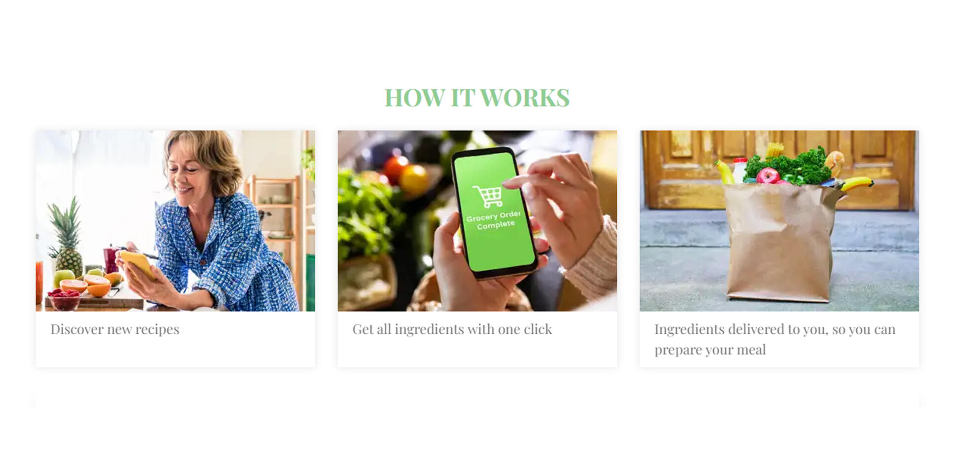
Additionally, to clarify even further we also added a 'How it works' diagram above the fold, clearly outlining the three-step process for users.
ITERATION
Further user testing showed the hero banner and diagram led to significant improvement in feature comprehension. However, we discovered a new challenge. Users were unsure whether or not the grocery delivery service was available in their area.
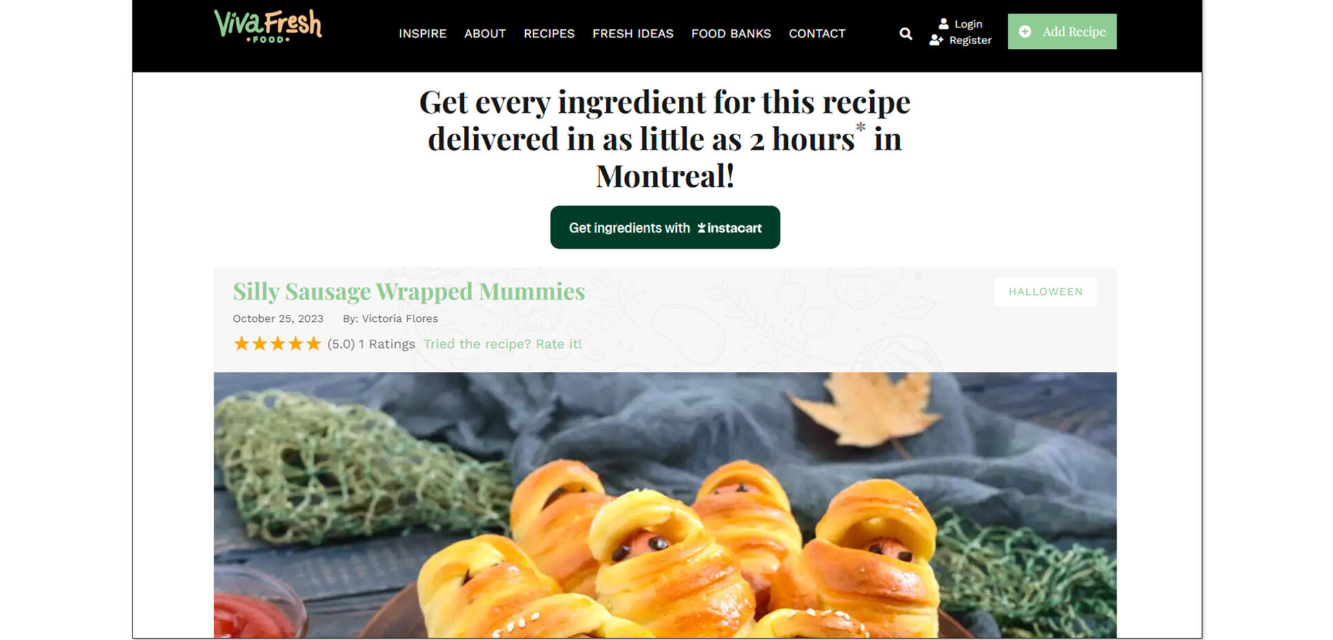
Through additional brainstorming sessions, we developed geo-specific messaging that appeared on recipe pages, automatically displaying a delivery promise: "Get every ingredient for this recipe delivered in as little as 2 hours* in Montreal!" based on the user's detected location.
RESULTS
Follow-up usability testing showed that feature comprehension improved dramatically from 15% to 75% of users understanding the one-click shopping capability by the time they reached recipe pages.
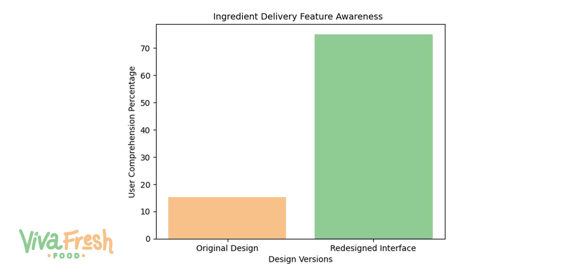
The combination of the hero banner, the "How it Works" diagram, and the geo-specific messaging successfully transformed a hidden feature into the primary value proposition users were able to immediately recognize and understand.
Viva Fresh Foods Designs
Team leader for the complete creative development of the recipe website, collaborating cross-functionally with development. Oversaw content creation and design of all visual elements including homepage, recipe pages, articles, and newsletter. Managed contest campaigns with contestant interaction and used user testing and feedback to inform iterative design decisions. Select work from this project is shown in the gallery below.
As part of this project, I created video advertisements promoting recipes across different markets. Developed both general brand videos and targeted campaigns that matched specific recipes with regional audiences.
OTHER DESIGN WORK
Labels, billboards, PowerPoint presentations, business cards and more.
Contact
Have questions about my work or want to discuss an opportunity? Reach out via email using the button below or give me a call anytime at 506-380-9215.
Design Projects
UX & Design


